Random thoughts on a perennial user interface dilemma: form or function?
Minimalism has had broad cultural influences on Music, Architecture, Design and, of course, Fashion, Software and Application design.
You might think this is all about aesthetics, and discount that as a matter of personal taste. You could not be more wrong.
Minimalism is not about being vegan and loving the planet, it is not about avoiding waste. Minimalism is all about deliberately avoiding complexity, both internally (where it can’t be seen) and externally (where it is self-evident).
A fashion example of minimalism would be the Tubino. A little black dress made with just one piece of cloth. It is simple, elegant, functional.
When it comes to software design, minimalism is a necessity.
Its main assumptions are “Forms Follows Function”, and believing that a system should contain only parts which are useful to perform its function, that is removing all the unnecessary fat.
Yes, we in the software industry tend to “steal” ideas from Architecture, intended as the intentional design of spaces. Another idea we stole
In architecture, the exact opposite of functional minimalism is a purely decorative style, e.g., Baroque, Rococo.
This visual complexity translates to “Lots of floral decoration and visual candy”, with zero structural function. Some will find the term “visual candy” disparaging, but that is precisely its definition if it is an element or an attribute which does not have a function. Let’s call a spade a spade.
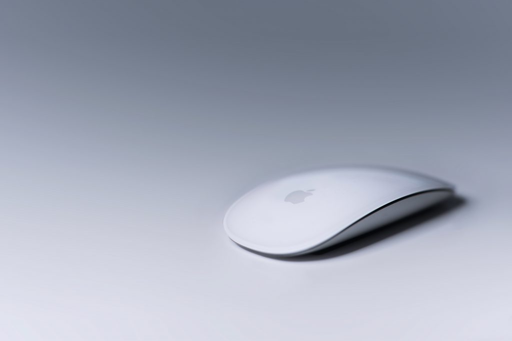
John Ives had given Apple its cold, cool, clean trademark look and feel.
Why would you want to mar an Apple product with your cartoonish, baroque complexity?
Pretty is the enemy of any hope of Excellent. A racing sports car isn’t elegant because of aesthetics. It has fluid curves because those curves serve a well-defined purpose, letting it cut the airflow more efficiently. A racing car will have been designed by making it leaner and by removing all unnecessary weight. Less is a lot more. A racing car is not pretty; it is a well-designed lean raging beauty. In information technology, a part which does not exist does not cause errors, and if things are as simple as possible, that minimises costs! Also, a leaner architecture only performs the minimal processing necessary to get the job done. Usually, that translates to speed, and speed is never a bad thing to have in a system. In terms of App design, choosing a straightforward, minimalistic design enhances clarity, declutters, and also impacts performance and, very importantly, user experience. Did I mention that a non-minimalistic style also costs about four times in terms of development effort? Yes, because whenever you add a non-necessary shadow to an element, you increase the likelihood of non-conformance: Will that shadow
And if you pick a yes person as your lead, you won’t ever have your thinking process challenged. You WILL deliver a worse, often inadequate product. And you won’t even know, because you will be impervious to evidence, you will censor all conflicting signals from the environment. And you will be exchanging self congratulatory pats on the back about how good you are as an organisation.
So, whenever you are facing a choice between an ornate style and a leaner one, you should choose the latter. If you stick to minimalism in your app interface, mobile users won’t have to wait for the increased processing time all those pesky gradients, rounded edges and strictly decorative shadows. Your App won’t look cartoonish and graphically elaborate, but it can instead be elegant and blazing fast.
If you expand this thinking to system design, a system with less parts is a system with less that can go wrong and hit you in the face, it will be easier and less expensive to maintain.
Unless you have really important goals to achieve with complexity, simplicity is really hard to beat.


